Event Review: Take Cover With Jon Gray

Event Review: Take Cover With Jon Gray
Amy Smolcic
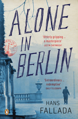
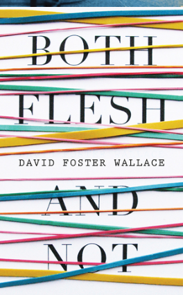
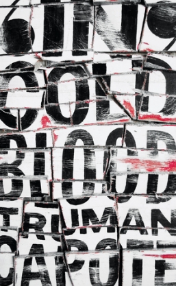
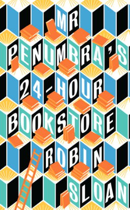
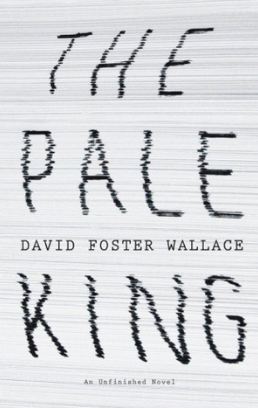
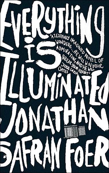
The Wheeler Centre and the Australian Book Designers Association hosted another incredible public lecture after the success of last year’s event. This year’s guest was the legendary Jon Gray, whose work you might have seen on the covers of iconic titles such as Everything Is Illuminated by Jonathan Safran Foer, Infinite Jest by David Foster Wallace, Alone In Berlin by Hans Fallada and many others.
He began his lecture by comparing his craft of creating book covers to burgers. I hadn’t had dinner yet, so all the pictures of burgers teased my appetite (even the sloppy looking Whopper from Hungry Jacks). But he did make some valid points: it’s incredibly annoying when advertising shows off picturesque burgers and then the final product looks nothing like what’s advertised. He connected this to books and the importance of capturing the magic of the book on the cover.
He stated that much of the book design industry is like the fast-food, Whopper kind of burgers. There isn’t enough heart in the creation process, all it is to the designer is another job. Designers like Gray aim to experiment with different ingredients and try to push boundaries on what we consider the norm. Any lecturer who connects what they do to burgers is sure to win me over.
He also discussed that sometimes he finds himself in between being a graphic designer and illustrator. Part of the style that has made him prolific is his use of type (particularly hand drawn type). He mentioned that he uses type as the illustration on the covers and attempts to capture the emotion of the book in the type – this sees type playing a double role where it’s not only a method of communication but also has illustrative powers. It takes a great designer to be able to capture this in type and Gray is one of the finer examples of how this can be done impeccably.
Gray also spent a bit of time during his talk discussing his first iconic cover for Everything Is Illuminated, completed with regular collaborator and friend Jonathan Safran Foer. This handcrafted type that launched his career was beginning to be requested by every publishing house he worked with. He was starting to feel like a cook, quickly putting together burgers at McDonalds. He also noted that the original inspiration behind the design was antique handmade signs and the spontaneity of them.
If you ever want to know if designers read the books of the covers they design, he cleared this up. He mentioned that sometimes designers would only read the brief, but he ensures that he reads the manuscript before crafting the cover. Although when he worked on Zadie Smith’s N-W, all Smith provided him with was a setting and time period.
The night provided a wonderful insight into his craft and the considerations he makes when using type on his covers. I can almost guarantee that if you walk into a bookstore, you would be able to spot his covers (even though he seems to think his finest work is found on the shelves of second-hand op shops).
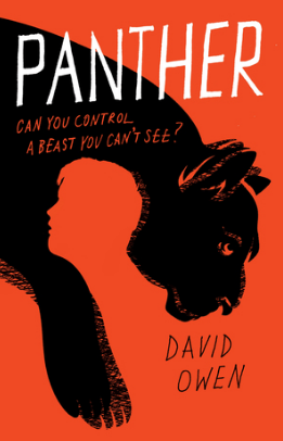
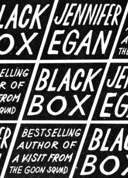
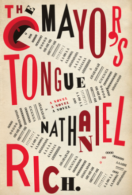
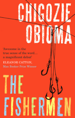
Check out some of Jon Gray's designs below