
Pen portraits 01
You can tell a lot about a writer by the type of pen they use…

Patrick Boyle – Artline ® 200 (ideally 0.2mm, but will settle for 0.4mm)
The chic minimalism of a felt tip pen can never be overstated. Search your brain for a more satisfying sound than that of an Artline200 striking the unsuspecting page. This triggers a sense of satisfaction I’ve yet to replicate in any other facet of my life. In theory, each pen offers 2,000 metres of scribbling joy. Yet some- how, despite the long spatula-ed pocket clip which protrudes from their lids, I manage to lose a handful of Artline200s each month. The cumulative sense of grief might one day kill me. I am seriously contemplating the liquidation of my superannuation fund, in order to finance a literal lifetime supply of my tubular accomplices. It seems, at this point, my only option.

Tanika Gondhali – Uni-ball Gel
The moment when you can’t read your own handwriting is a wakeup call. A generic black ball point has been my go-to pen since the age of 16, my own tiny rebellion against years of uni- formity experienced under school regulations. My new choice was not blue and very far from the ideal pen, my teachers would suggest. It felt like freedom at last! Ten years later, as I went through my frantically written notes before class, I was amazed that I couldn’t recognise my own handwriting! This was the previously mentioned wake-up call. I immediately went and bought a different set of pens – the Uni-ball gel-based pens. I loved how they helped me control my writing! It was much later I realised I was back to using the kind of pens my teachers had insisted on all those years ago.
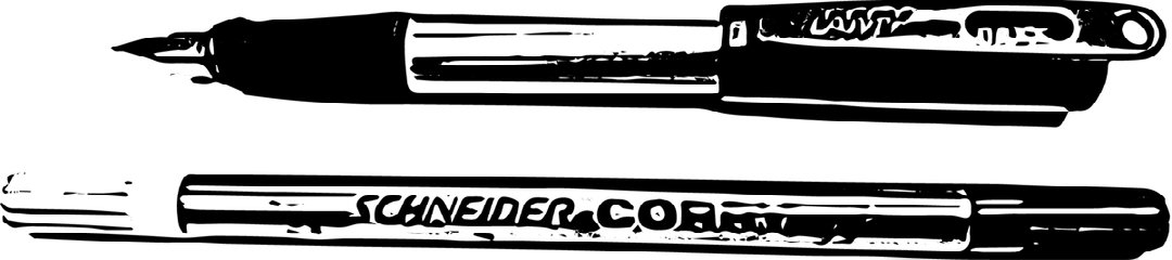
Freya Howarth – Lamy fountain pen and Schneider Corry
A Lamy fountain pen with blue ink is a perfect pen for editing; blue stands out against black type, but still shows up when pho- tocopied. It’s forgiving: its companion correction pen gives you a second chance to get things right, without the unsightly pasting of whiteout. The correction pen also works for sending secret messages: write your secret missive with the clear correction ink; the recipient colours over the page with fountain pen ink to reveal the message. This combination of pens was enforced by my school in France, but I’ve stuck with it since as it makes my writing more elegant (or at least legible). The downside of using a fountain pen is that it can smudge, or bleed if the paper quality is poor – I’m always on the look-out for high quality paper. I’ve heard that fountain pen nibs adapt to their owner’s writing style through use, so always keep your pen to yourself!
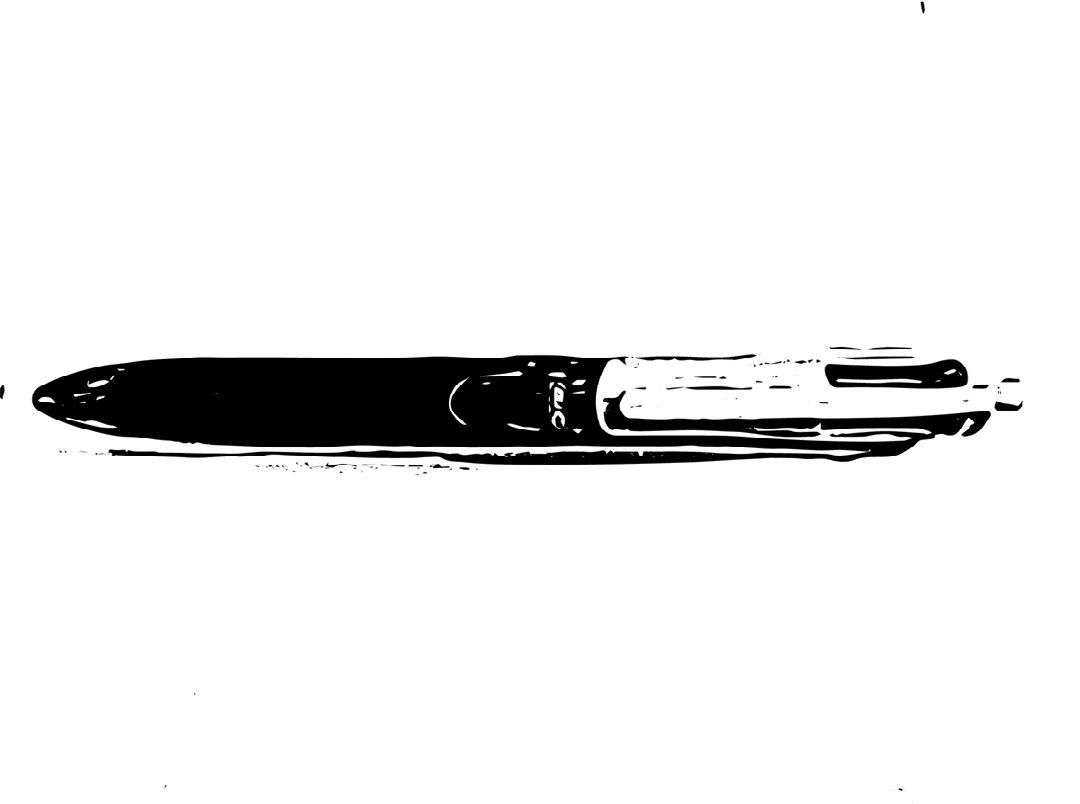
Nicolette Jahn – Bic PaperMate clicky pen
Imagine, a waitress walks to table 10 to take their order and in the steps it takes to put it in for the kitchen: table four stops her to ask for a bottle of water; table seven waves because they remembered they don’t like pickles on the burger and needs her to change it before their food is made; the chef rings the bell because food is sitting in the pass; and new customers sit down at table three and they need menus. Everything is urgent and needs to be done five seconds ago before hangry customers turn this restaurant into the cannibal feast from Pirates of the Caribbean. Now do that for nine hours. Yeah, I forget things and need to write down orders. On Tuesday, 10 April my manager asks for my pen. Without hesitation, and with a slight fear of being insubordinate, I hand it over. Guess what happens next? Yup, he never gives it back. I end up snagging some capped pen. My clicky pen is perfect: I’m ready to write and no uncapped marking mishaps. I brave my manager about his pen thievery (the nearby barista is snickering) and the manager has the audacity to say, “oh, I gave it to a customer. Let me get you one.” Now guess what happens? He never comes back. (Did you notice? I stole a pen too!)
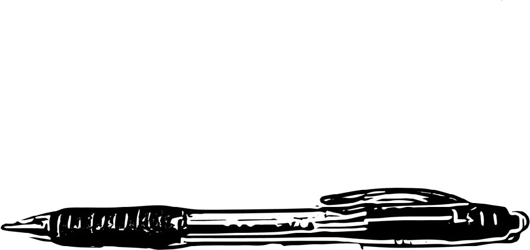
Hilary Van Leeuwen – Four-colour ballpoint pen
Any brand or breed of four-colour ballpoint pen is my idea of a pen for any and every occasion. Black for filling in forms, blue for when you don’t want to use black, red for correction and green... to round out the four. My years of being an anally retentive high school student who ruled red perfect margins, wrote headings in black and all other notes in blue, were clearly some of my most formative. Now six years on, I have ditched the margins (mainly because I don’t own a ruler) but the dates and headings have stuck. The (illusion of) organisation my beautiful colour coded notes offer me is satisfying to say the least, even if they do look like they were written by a year eight student…